
|
As You want, I can use these for my own set.
Yes, I'm being rude. |
Quote:
|
I think that Ementaler's tiles (or a less detailed version of my originals) could fit into DodgeS' idea with some appropriate recoloring and deisometrication, as a (layer 4) background. I can post an image of what I mean in a few hours if necessary. I would vote for losing isometricity from Ementaler's over adding it to DodgeS' because isometric tilesets, particularly ones that use the full isometric and not what Disguise calls "Semi-isometric" perspective, are harder to use, take up significantly more tiles, and take more time to make. Also I think that cases like in this thread, where the isometric floor uses the same graphics as the actual wall tile, are easily the least attractive way of making an isometric perspective. It works well in nature tilesets, for instance, because your floor is grass and your wall is dirt or rocks or something and they look distinct and interesting, but I don't feel the tileset gains anything from doing it this way.
ETA: Also I like DodgeS' floor and feel it has some good possibilities for walls that are interesting to look at, especially as it is built on and given more variation. |
Too late.
[IMG]http://img227.imageshack.us/img227/6684/lmat05.png[/IMG] Yeah, it looks and it is incomplete, but I couldn't take the whole fun myself, so only the basics are done. Force someone to arrange the tiles. Violet, I don't care what you will do, really. Personally, I like it as it is, but maybe we really should change it. Maybe some poll in a separate thread? |
It does not fit at all.
|
Quote:
EDIT: Just viewed some posts here, and I have to make a statement that I think that DodgeS and Sir Ementaler have currently potential to ruin this whole project. |
This sort of thing. Ementaler's edits could be used equally well, but it would probably have taken me longer to illustrate what I meant with someone else's tiles, so I took a shortcut. (I also included a proposed slight modification to the edges of DodgeS' walls, because I felt they could use a little more color variation.)
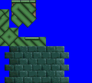 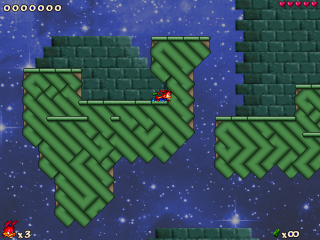 ETA: Any person or set of people has the potential to ruin a group project if there aren't enough other people contributing. Where are the twelve users who indicated they would help create an elemental temple, or the nine who wanted to help with a spaceport/airport? |
Quote:
Quote:
|
DodgeS' tiles look alright, but if it's a space temple I think they should look a bit more rocky, rather than looking like pipes. I also agree that the isometric style can get a bit messy, so maybe we should go with 2D for now. Oh, and I don't think the orange bits match too well...
|
[IMG]http://img690.imageshack.us/img690/1950/spacetempleimg2.png[/IMG]
[IMG]http://img249.imageshack.us/img249/6148/screen111lmat.png[/IMG] |
If we want to make a space temple, I guess we need some inside tiles too. As the bricks in the background don't really remind my tiles, maybe I could just edit my tiles to be 2D and they'd make it in?
|
Quote:
|
[IMG]http://img9.imageshack.us/img9/46/lmat06.png[/IMG]
Whaddya think? |
As i said - doesn't fit.
|
Quote:
Quote:
|
No offence, but it's ugly and i am not able to make it 'work'.
Download Tile Studio and try to make new tiles better. ---------------------------------------------------- I don't know how can I improve the door... This is not the best, but w/e. [IMG]http://img88.imageshack.us/img88/1950/spacetempleimg2.png[/IMG] |
Quote:
|
You drew "more-space-temple tiles"? I can see only orange blocks that are 'rather-ugly' and don't look like space tiles. And how do we know how does space temple look like? Everything here will depend on background.
I use both of the programs simultaneously. Most of my work is done in MS Paint, and 1 effect is added in TileStudio to make it look better. Quote:
|
 ? |
Yes, I was thinking about these too, but I decided they'd remind Sirius too much.
|
ok fine. Here's some solar panels and the top half of layer 7 or 8
[IMG]http://chaos.foxmage.com/n0/lmatBeyond.png[/IMG] [IMG]http://chaos.foxmage.com/n0/lmatbeyond2.png[/IMG] |
Sir Ementaler's tiles and DodgeS' tiles don't match. The orange just doesn't look right with the green, if you ask me. Anyway, I'm not too sure about the angled blocks either. That was the part I didn't like about Sirius.
EDIT: How are these for cave tiles? [IMG]http://i1026.photobucket.com/albums/y324/Obi1mcd/LMAT_01.png[/IMG] |
I have a weird feeling that we're going in a wrong direction. I think I'll just return to making this tileset when you'll be sure which tiles will you use. Just remember what's the theme, because right now only n0's tiles and the door remind me space, and only Violet's tiles remind me a temple, while the most important tiles of the tileset (the ground) remind me that cool game Knytt Stories, which has nothing to do with space nor a temple.
About the cave tiles, I think they're too bright. Maybe it's just me, but before I read they're for cave, I thought they're solid. And we already have something like cave tiles, but I guess I'm worrying too much. |
Who cares about the theme? We will find it out later, what the theme is XD. Elemental temple won, Spaceport was temporary winning...
Cave tiles are cool. I would only remove some stones on corners or even all edges to make it more natural. Obi, why did You take older version of this "set"? If there wasn't something right you should mention that, if no - try to not miss any tiles. UR, these angled blocks are not so bad, but we should change its color. Probably, I will do it later. Sir Ementaler, thank You, it would be easier without You. |
Quote:
|
Is it really so important? What's the difference if it will be space temple or ancient Greece?
|
A sense of direction is rather useful when working on a tileset, especially with several people. I suppose it's okay to deviate a bit in the name of artistic freedom, but having one coherent overaching theme for the tiles makes it easier to work on a set.
Of course I haven't contributed anything yet, so maybe I should shut up, but then again part of the reason for that is that there seem to be a few conflicting views on what direction to head in with the set and I'd like to wait until that's clear before making an attempt. |
Well, basically, just a while ago I decided to delete all of your tiles, because they were too ugly and didn't fit to these:
[IMG]http://img375.imageshack.us/img375/8267/thinkgrounds.png[/IMG] They're cool and animated, so we should work at them now. |
Quote:
Quote:
|
Quote:
[IMG]http://img808.imageshack.us/img808/6346/redrock.png[/IMG] It's not my best one of course, but the others are secret. |
Quote:
|
If you are really going to make a space temple, take those Sir Ementaler's tiles, add a space on the back and you have won.
Or, if it is a airport, mess it up with Blade's space tileset. |
This reminds me some of the tiles from Windstorm Fortress [By BlurredD]. Of course Windstorm Fortress is million times better, just because it uses plenty of various colors and textures, not only two, and it doesn't include so many useless tiles. Yes, this does look nice, but not original and not space-themed too.
|
DodgeS, please show some sign that you are able to play nice with others. This is a community project, and right now you I feel you are evoking a lot of hostility, repeatedly employing unhelpful language, and showing very little flexibility.
|
Orange-doesn't-fit-to-green-make-it-green guy says my tileset is uncolored, I should kill myself. Well, I probably would, if not the four facts: it's unfinished, it's abandoned, it's old and it's an idea for LMAT, not for a review. Also, the background and only the background is inspired by WSF. The whole rest can't remind you that tileset, as this thing here is isometric. And I'm not sure which tiles do you find useless, but I guess they're some of these unfinished or hardly ever used. They can be deleted within two clicks of your mouse, it's LMAT.
|
Quote:
Someone has to be ruthless. In other way this would be another ordinary set, because of accepting every tile which someone draw... Now, everything is different. There were so many experienced players working on previous LMATs, now here are only few of them or others less experienced. That's why You should criticize our work more too. To all of You who do not contribute: You should tell us what do You like or don't like. Give us some advices so we will know which is the best way to make it. |
You have no idea how jealous I am about Stijn's choice now. *sigh*
|
He wasn't just so sure how my tiles relate to the theme, he didn't say mine are worse :)
|
I mean that he decided not to work before the theme is decided. I could do the same.
|
i would like to contribute something too, but i am currently not sure if its really safe, considering you two keep removing each others tiles and stuff like that.
but i guess i can draw something and post it and then it can be added or so. |
| All times are GMT -8. The time now is 04:52 PM. |
Powered by vBulletin® Copyright ©2000 - 2026, Jelsoft Enterprises Ltd.
JCF © 2001-Infinity Jazz2Online