
|
what about ground without the vine stuff with the dirt instead
|
Yeah. So much more important then slopes and vines and hooks and other such needed tiles.
|
[IMG]http://www.jazz2online.com/d3/forcefield.png[/IMG]
I still like yellow over blue a bit more since it fits in better. But I suppose both could be used if there are still disagreements. By the way, I'm not planning on doing that "shading frenzy" thing just yet, so don't wait for me. |
Quote:
|
It was intended not to look pretty.
|
How bout you call it: Corossive Zone
|
That sounds like a sonic ripoff.
|
That... was, well, the point. I like simple names. OH! You could call the tileset: Swampwater! No ripoffs!
|
Kansas isn't a ripoff either.
I'm almost about to do some changes myself. |
When totally erasing peoples' work, I suggest you at least ask them beforehand. The first post asked you to edit, not redraw from scratch.
|
If you ask me, the wooden pipe stuff should be changed to a metallic gray instead of green... There would be no need to worry about the brown badly contrasting with green and gray, as the pipes would be gray themselves.
..and when someone's at it, the color of the cave tiles could be changed so it looked like metal. For the same reason as above. |
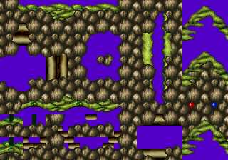 Increased functionality. :D |
.. wow. You were busy. =O
|
I LOVE this tileset. Too bad I can't draw that well, or edit... or... Anything... :(
*Waits for the final version* (Someone PM me when it's done please... :D ) |
if its finisht i am full standing ready too make a example level
|
[IMG]http://www.jazz2online.com/d3/metal.png[/IMG]
A fairly quick edit and an alternative to the other tiles. I thought the tileset needed it. (The colors seem to clash more after I reset the Color Correction on my monitor. Oh well.) Also, great job on the edit, Violet. |
Quote:
|
[img]http://img363.imageshack.us/img363/7253/kansastubes9jr.png[/img]
Alright... What else does this set need... uh... (Looks up Event List) |
A few suggestions for things that might be interesting to add, but which I will not have the time to unless I work on the 31st:
|
Also:
* H-Poles * V-Poles * Hooks * Water Block * Belts I'll do a textured background once it's finished. My free time is slipping away, however. School starts Tuesday. |
How do I post images?
I figured out the V-Poles |
Since Blurred has apparently made my metal/stone/whatever plates solid, transition tiles between the plates and the normal ground would be nice. If nobody else wants to, I could make simple ones.
|
Risp: They don't look solid to me! Still look like cave tiles...
FireBird: http:\\www.imageshack.us Then put the "Direct Link to Image" link inbetween [ |
Oh, I thought I saw blurred adding cavetiles to it in that picture... nevermind, then. Still, it'd be nice to be able to put them behind normal ground without using layer 5.
|
[IMG]http://img288.imageshack.us/img288/6316/poles7bv.png[/IMG]
Would this work for poles? |
Currently being done stuff-
Islandish BG characters, each with a mechanical version Technological stuff like computer terminals,fancy chairs, Spheres with alien text flying around it, etc. etc. |
Quote:
|
I'd make them a bit thinner.
|
i would like them thinner aswell
|
And I'd like your sig to be less flashy and eplitec(I need to find out the correct spelling of that) prone. I'm looking at it out of the corner of my eye and my head is already hurting badly.
|
:P changed it :D and now it has uber spelling ;D
(it needs the framerate i gave it though it was slowed down some how) FIX THE POLES!!! |
Dang, deadline is getting close and I still haven't finished my addition.
|
Quote:
|
Here V-poles and H-poles
[IMG]http://img240.imageshack.us/img240/9409/polesv26ez.png[/IMG] |
nice ...thumbnail
|
What about H poles that stick up from the ground?
|
In case nobody noticed I just shrunk the wood tiles to 25% to make the poles really not much effort
They do look good though |
>( they are still to thick
|
Fine. I'll make a thinner version.
|
[IMG]http://img377.imageshack.us/img377/8819/polesv219tz.png[/IMG]
If that's better please say so I think it $ucks |
| All times are GMT -8. The time now is 09:19 AM. |
Powered by vBulletin® Copyright ©2000 - 2026, Jelsoft Enterprises Ltd.
JCF © 2001-Infinity Jazz2Online