
|
Palette Suite does gradients pretty well.
|
Uh, can't you use that color change tool?
|
Thank you for the advice! Palette suite is awesome!
|
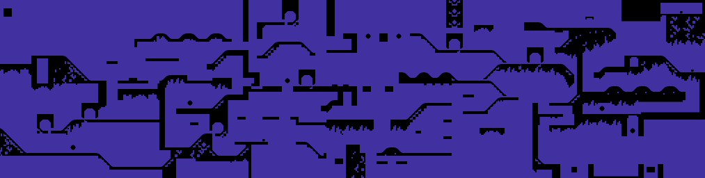 Nearly-complete layout for Star Light Zone act 1. Loops and fans and springs and all that good stuff. It's possible to complete this one in like 28 seconds if you know what you're doing, but it's supposed to be a fast planet, so that's fine. And development took just two months instead of three; production rate is increasing like wildfire! |
Some pics from a WIP Diamondus thing I have going on. I doubt, by the way, that it'll be particularly challenging.
[IMG]http://i1003.photobucket.com/albums/af160/Baronofevil/Shot1.jpg?t=1323042436[/IMG] [IMG]http://i1003.photobucket.com/albums/af160/Baronofevil/Shot2.jpg?t=1323042436[/IMG] Damn, I neglected to put the images into png. |
That last screenshot uses too many trees for me.
|
Nah I think it's good, keep it up.
|
It has lots of trees because it is my attempt at making something like a bayou or marsh.
|
That makes sense then.
|
Damn lighting, how does it work? =3=
|
In a nutshell, you can't have lighting and water at once. (There are exceptions, but they won't work in your situation, if we're talking about the Diamondus level above.)
|
Well. That sucks. Especially when I want to make a mine-based level after that one. I'll work something out there.
Well. Just have to add some more events in there and I'll have to find someone bored enough to test the silly thing. |
If you need ambient lighting following a section with water, you can just split it off into a separate .j2l. If you need them at the same time, though, you're SOL.
|
How annoying.
Anyway. Now to polish off the rough edges. |
[IMG]http://img849.imageshack.us/img849/1051/screenageagain.png[/IMG]
To keep your interest. VERY WIP shot of a Lava Fortress level. Pictured: 1. 2. A reality-law-breaking facility wedged directly in the middle of an active volcano. Yes, active. 3. Extensive tube system which actually makes perfect sense if you think about it. 4. Animals not getting burnt to death by just standing near lava It's tough to make things natural looking when tilesets often offer straight lines where nature is extremely random, but hopefully I can make it work. |
5. Unfinished wall
6. A death pit without any warning sign (judging from Jazz being off center at the screenshot?) |
Quote:
|
Quote:
|
Quote:
|
It does scroll the screen up...
|
wtf
I meant to type down!
:drugs: |
[img]http://img37.imageshack.us/img37/8650/kccts.png[/img]
I have just started this one. |
Lookin' pretty damn good.
|
[IMG]http://img444.imageshack.us/img444/1518/teaser.png[/IMG]
|
I like the open sides.
|
>2011
>CelL making a level >feelsgoodman.jpg |
In a polar (heh) opposite of my previous screen, a cold as 'hell' area!
[IMG]http://img408.imageshack.us/img408/5543/infernoscreenislovely.png[/IMG] Inferno has to be the buggiest set I've ever dealt with. No, I haven't worked with Colony yet. |
>2011
>still using the 2011-meme >not knowing how to greentext ISHYGDDT |
why would I do it manually if I don't have to on imageboards
and Sean, I know that feel. Also, liking the text string :D |
Colony isn't anywhere near as bad.
|
From what I've heard it seems some people think so.
|
The masking is the worst part; at least P4ul made a fix for the night palette which resolves this. Colony isn't too hard to tile correctly, whereas as Inferno is virtually impossible to use without having some tile bugs, and also has a dodgy mask.
|
I understand the impossibility of using Inferno without tilebugs, and I'm already looking into possibly redoing the whole level using a different tileset, but Inferno just looks nice, and that's something that's hard to find, so it's easy enough to ignore the tilebugs during actual playing.
|
Quote:
Looks like a very original yet typical 'Fortress' layout. And it's Battle which is even more amazing. |
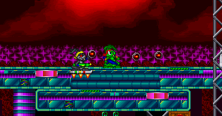 Trying to decide on a color for the Jazz clone's gun. Thoughts? (nothing in shot is final.) |
Yellow. Would fit his bandana.
|
I think red would look better.
|
Quote:
Could you perhaps make the clone look more like Spaz? |
I'd go with white...
|
I'm cool with green, it reflects his original "weapon".
|
| All times are GMT -8. The time now is 04:59 AM. |
Powered by vBulletin® Copyright ©2000 - 2026, Jelsoft Enterprises Ltd.
JCF © 2001-Infinity Jazz2Online