Quote:
Originally Posted by Violet CLM

Another build
Tried for a sharper cog with fewer indents. As I mentioned, it's impossible to have admin icons a) always align vertically, b) be on the left of player names, and c) not come between player names and gamemode icons. So I tried moving admin icons, and mute icons, and plus version icons, over to the right, where less important stuff lives. And also moving the whole player list over to the left to compensate--it's always been weird how off-center the whole thing is.
|
I personally think the move of player's client metadata to the right side is a step towards the right direction, if we are introducing game mode icons on the left. 
I know the cog icon was colored green to resemble of the green 'A' for Admin, but in this case I would rather try to make it look like an actual cog image as much as possible to enable the new memory connection of a cog-icon standing for remote admin access. How would it look like if it was roughly the same color as the spectator name characters (dark grey or so)? My imagination tells me that this would make it look closest to a cog image, which could make it slightly more difficult to spot, but I'm not sure if that is necessarily a problem.
I'm not yet sure what I think of conditionally hiding the player numbers themselves, but I also cannot think of a better option at the moment. This might be another one of those changes that ultimately is a matter of getting used to, but it might also be quite a radical change for some people to digest. I'm also wondering, whether it is better to jump the player names to the right or the game icons to the left in order to make room for the player numbers and make it easier to notice the addition of extra data.
A bit besides the points mentioned regarding the player list; As since the beginning, exceptionally long player names will overlap with the right side information like player stats, as shown in the screenshot below. Since we're touching the player list in general here, I think it could be worth optimizing on the same go as well.
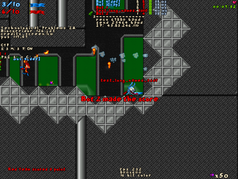
Since I doubt that people will want more empty space between short player names and player stats, I think the only reasonable is to further limit the maximum length of a player name, to let's say 15-16 because that seems to be on the border. If 16 is a safer choice in case of people playing with clantags etc. Then maybe a few more pixels (like 4-8?) could be added to the distance of player stats to the right? Considering this, we probably shouldn't be moving the player names conditionally depending on the display of player numbers.

I ran a quick scan on different player names found on https://jj2multiplayer.com/leaderboa...&mode=CTF_TEAM and it seems that the longest player names (13 characters) currently belong to [CDF]spaceboy and k43rSPLATinum. Otherwise to me it seems to me that people are generally used to short player names.
One question regarding the game mode icons themselves; How many of those is it possible to have on a player simultaneously? Like is there any kind of a combination game mode where there could be more than 1 icon at a time? Or what is possible to achieve via scripting? Etc.
__________________
Find It Out
SP: https://www.jazz2online.com/downloads/9371/find-it-out-single-player/
MP: http://www.jazz2online.com/J2Ov2/downloads/info.php?levelID=5021
|