


| Dec 27, 2009, 05:34 AM | |
|
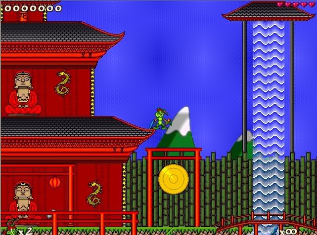
I agree with DoubleGJ, the tileset could definately use some background tiles. I suggest elements that would be typical of the far east, such as tall mountains and/or vast bamboo forests. That would make this set A+ material for sure.
|


| Dec 28, 2009, 05:30 PM | |
|
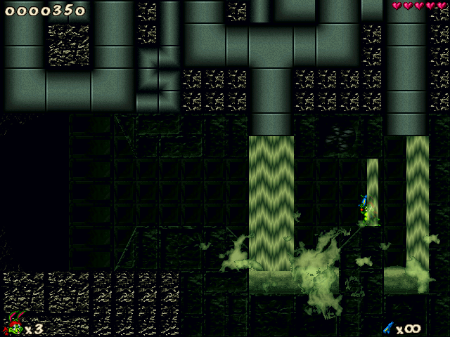
Untitled Project
   Something what ive been experimenting with. I apologise for bad quality images, but these are still alpha, so ofcourse I will try tweaking them as much as possible. Im not sure if I should have posted the third screen, though.
__________________

Last edited by snzspeed; Dec 28, 2009 at 06:24 PM. |

| Dec 28, 2009, 09:03 PM | |
|
That third one is ugly but obviously a work in progress (going to assume those textures are placeholders). Could turn out to be a good tileset, since I don't know of many tilesets with that theme. I suggest avoiding using photos/3d renderings as your backgrounds though, they simply do not translate well to 256 colour at all.
|
| Dec 29, 2009, 08:00 AM | |
|
yeah well, the third one is a level with a island + a bridge, which transitions into a huge city. Too bad the 256 color restriction indeed lowers the quality..
 altough i still love working with the photo scenery 
__________________
|


| Jan 1, 2010, 11:32 AM | |
|
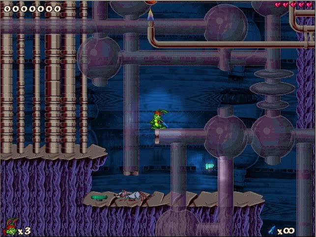
All fixed foreground stuff has to go (the black frames and whatnot).
Otherwise, it's quite interesting and well done. |

| Jan 1, 2010, 12:24 PM | |
|
2 Snzspeed: http://www.jazz2online.com/jcf/showthread.php?t=17249
") p.s. the screenies did remember me of the Duke Nukem jazz2 secret files level :P |


| Jan 3, 2010, 04:11 PM | ||
|
Quote:
|
||

| Jan 4, 2010, 01:02 PM | |
|
YES(!)
__________________
|

| Jan 4, 2010, 04:41 PM | |||
|
Quote:
I also feel like saying that I havent so far heard any comment like this, indicating that you're most likely being jerk, no offense intended. Quote:
__________________
Last edited by snzspeed; Jan 4, 2010 at 07:37 PM. |
|||
| Jan 5, 2010, 05:02 AM | |
|
Make the areas more open
|
| Jan 5, 2010, 06:10 AM | |
|
Well, that's only the start of the level...
If you would see the level itself, you would say that it should be bigger :/ It seems I cannot whip up anything big in singleplayer :S Maybe I could try to do something 8vs8 style, assault or assasination perhaps? |
| Jan 5, 2010, 08:44 AM | ||
|
Quote:
Funny how your reacting on something so small ^^. And it's more funnier how I just fooled you all at that time about 'Jazz X'  . . Still the whole stuff looks terrible, still didn't approve since 2007? Hahaha.
__________________
I eat people. |
||
| Jan 5, 2010, 08:52 AM | |
|
(Quote Removed -- Derby)
looks like im gonna have to call your nearest zoo that one of their apes is on the loose care to give me any reason why it looks terrible? ive asked that 4 times now and have gotten no reply.. maybe because you cant?
__________________
Last edited by Derby; Jan 5, 2010 at 03:49 PM. Reason: Personal attack removal. The removed content was in the quote, but this content was a (likely) altered paraphrase. |
| Jan 5, 2010, 09:00 AM | ||
|
Quote:
I just don't like it, accept it . Can you do that for me?
__________________
I eat people. |
||

| Jan 5, 2010, 09:07 AM | ||
|
Quote:
__________________
Last edited by snzspeed; Jan 5, 2010 at 09:39 AM. |
||
| Jan 5, 2010, 09:49 AM | ||
|
Saying that something looks "terrible" without saying why isnt exactly helpful. Thats why I was mad, I apologise if I have offended someone.. also
Quote:
Im not going to post here in a while. however if someone attacks me after this post, I will return to defend myself if it seems necessary..
__________________
Last edited by snzspeed; Jan 5, 2010 at 10:12 AM. |
||
| Jan 5, 2010, 10:11 AM | ||
|
Those screenshots look different here.. in-game they look much better. I know this because I have seen the levels + tilesets already. You can judge the levels only if you have seen them in JJ2, and not just because of some screenshots.
__________________
the epicness itself:  Quote:
|
||

| Jan 5, 2010, 10:25 AM | ||
|
Quote:
__________________
Mystic Legends http://www.mysticlegends.org/ The Price of Admission - Hoarfrost Hollow - Sacrosanct - other - stuff |
||
| Jan 5, 2010, 01:56 PM | |
 I've just started this. =p Last edited by DodgeS; Feb 19, 2010 at 03:13 PM. |

| Jan 5, 2010, 02:25 PM | |
|
The colors are really good, and it's an inventive pattern (hexagons), but the textures are mindnumbingly regular. There's no organic feeling.
__________________

|


| Jan 6, 2010, 08:13 PM | ||
|
Quote:
__________________
<.<
>.> -.- |
||

| Jan 8, 2010, 08:52 AM | ||
|
Quote:
__________________
Extraterrestrials Last edited by Sacrush; Jan 8, 2010 at 08:53 AM. Reason: I don't know. |
||
 |
«
Previous Thread
|
Next Thread
»
| Thread Tools | |


|
|

All times are GMT -8. The time now is 10:23 AM.
Jazz2Online © 1999-INFINITY (Site Credits). Jazz Jackrabbit, Jazz Jackrabbit 2, Jazz Jackrabbit Advance and all related trademarks and media are ™ and © Epic Games. Lori Jackrabbit is © Dean Dodrill. J2O development powered by Loops of Fury and Chemical Beats. Powered by vBulletin® Copyright ©2000 - 2024, Jelsoft Enterprises Ltd.
Original site design by Ovi Demetrian. DrJones is the puppet master. Eat your lima beans, Johnny.